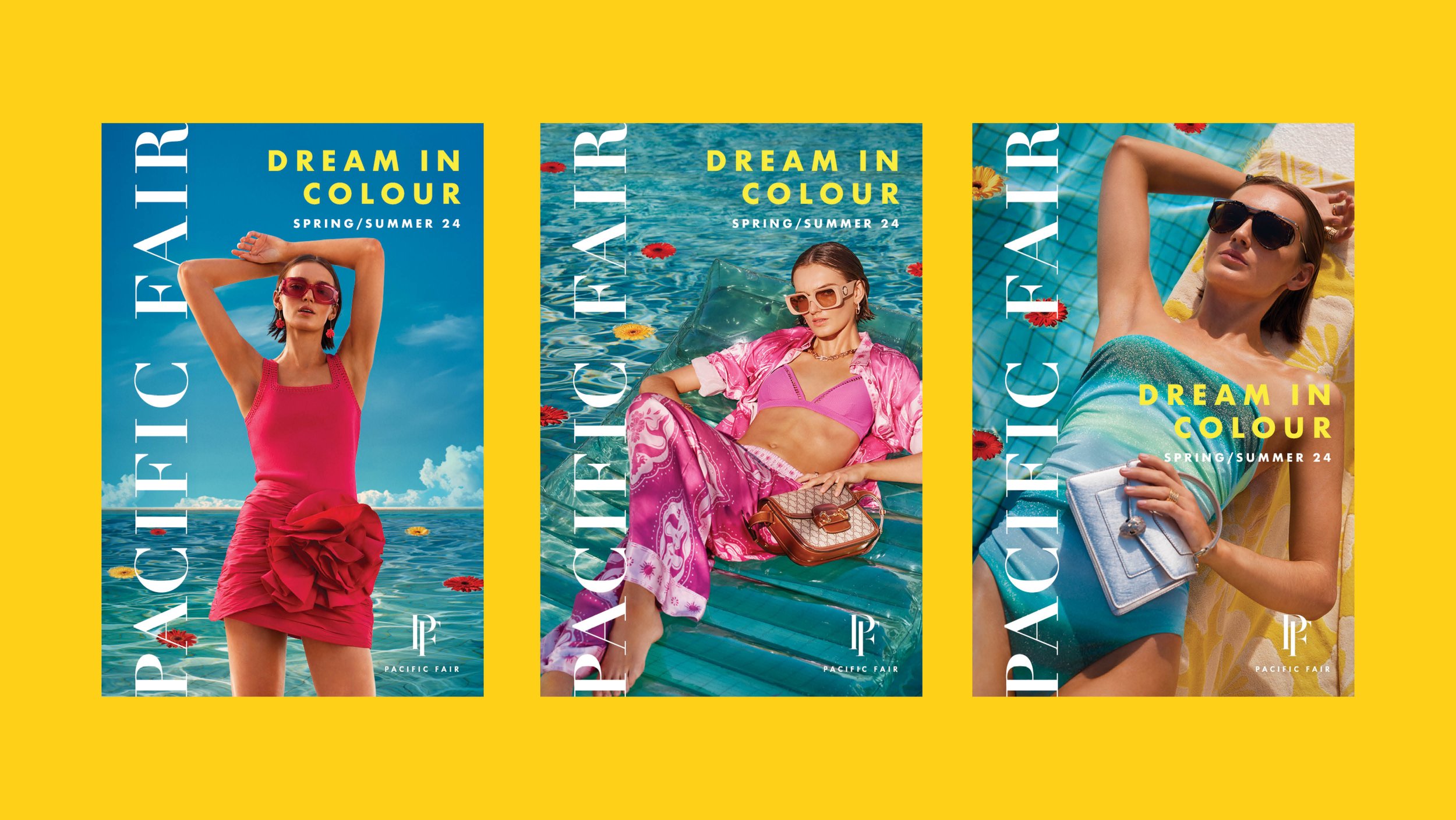
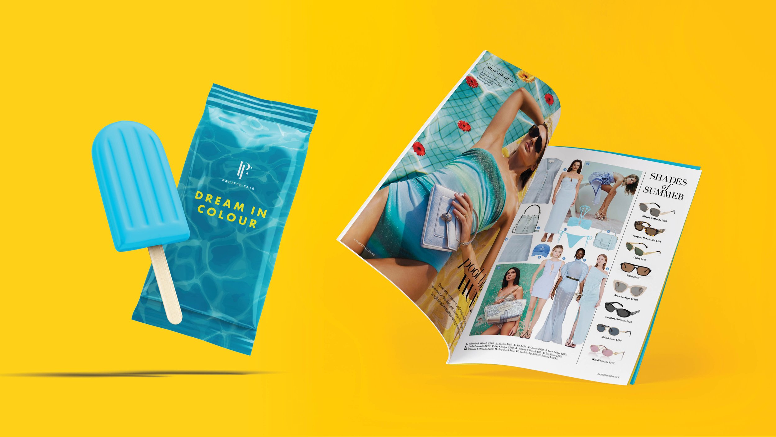
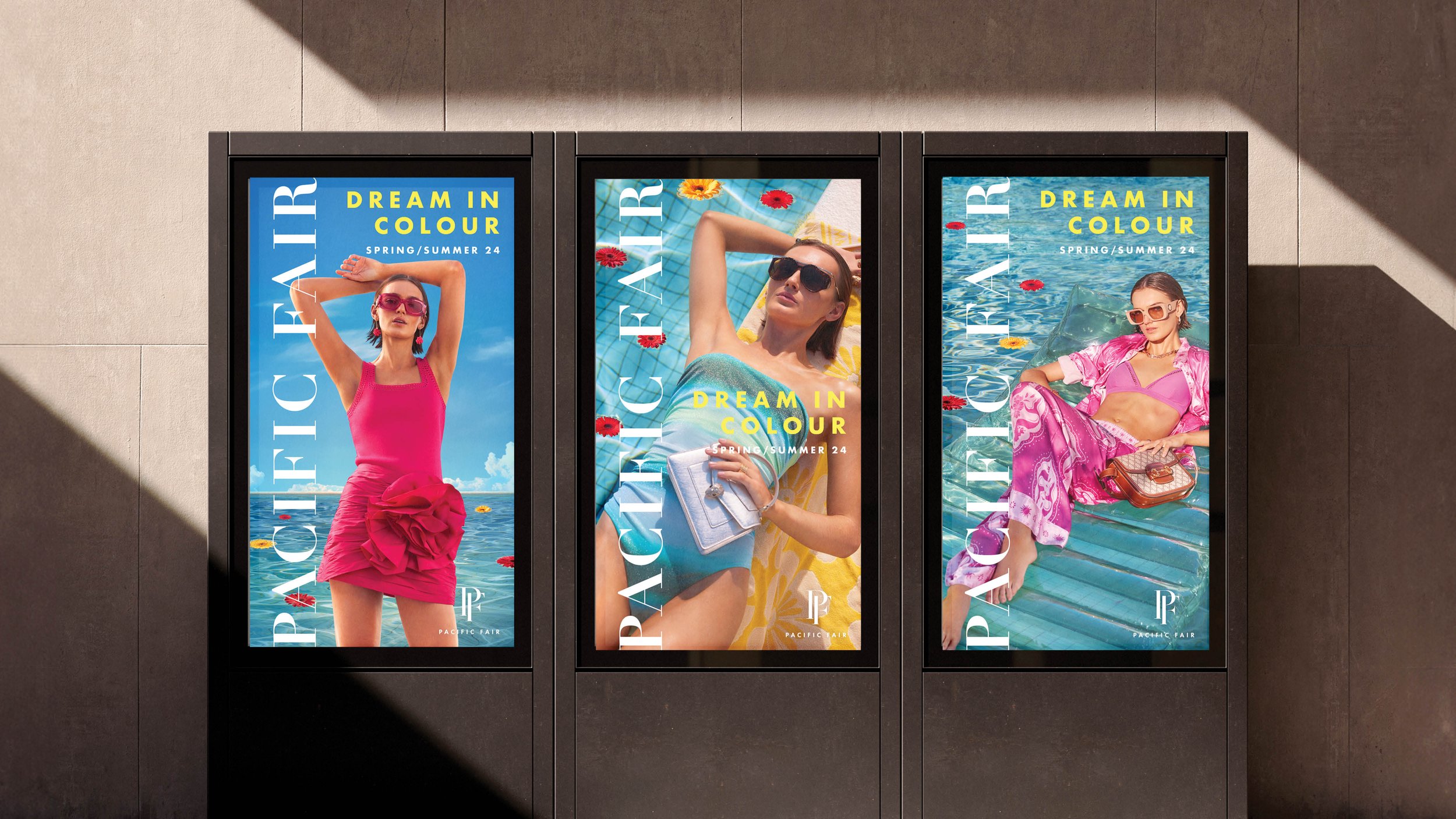
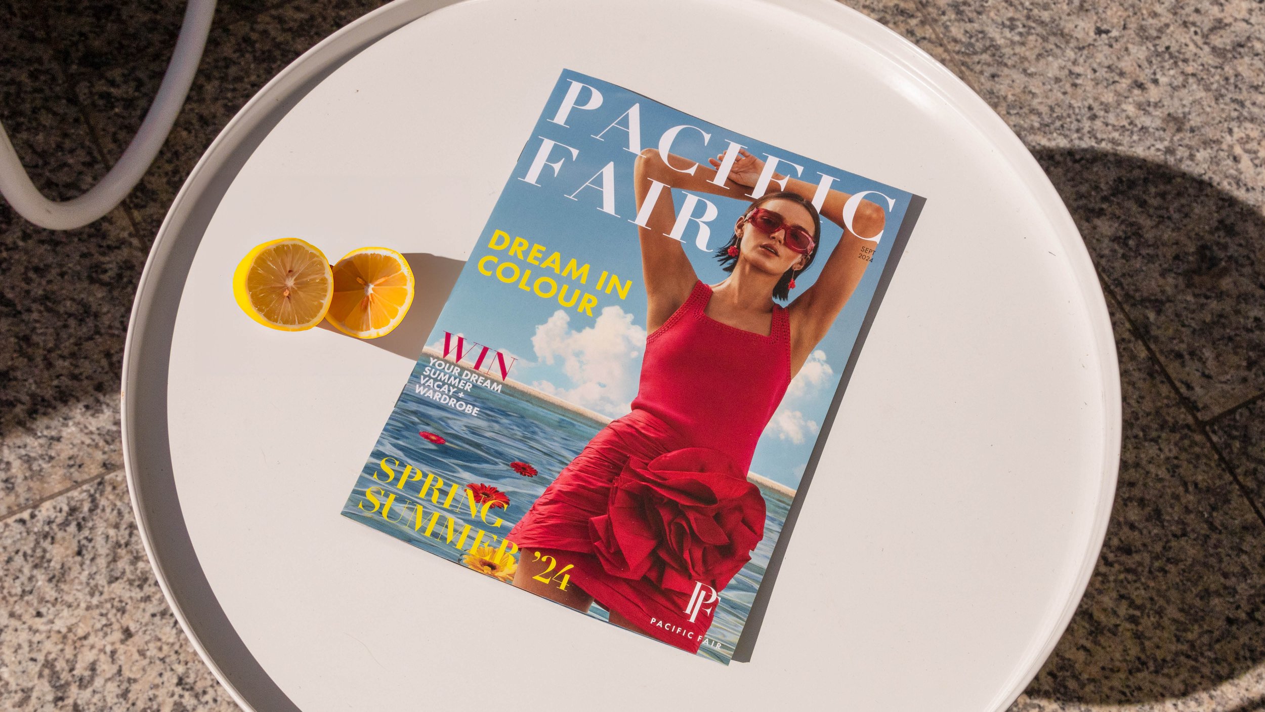
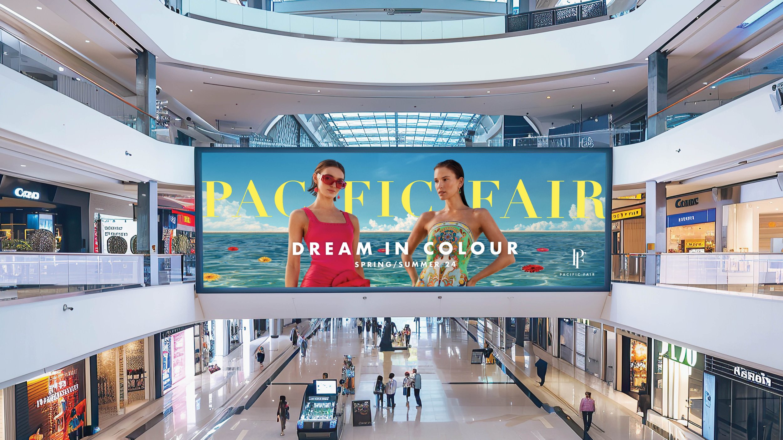
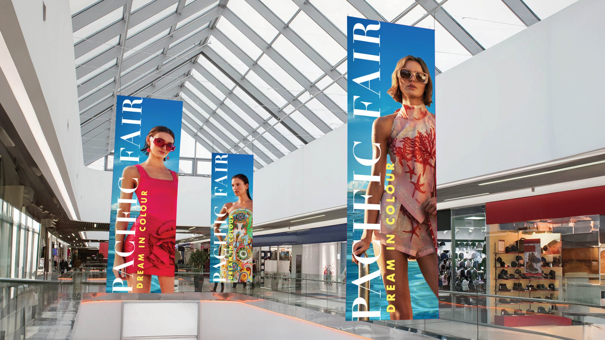
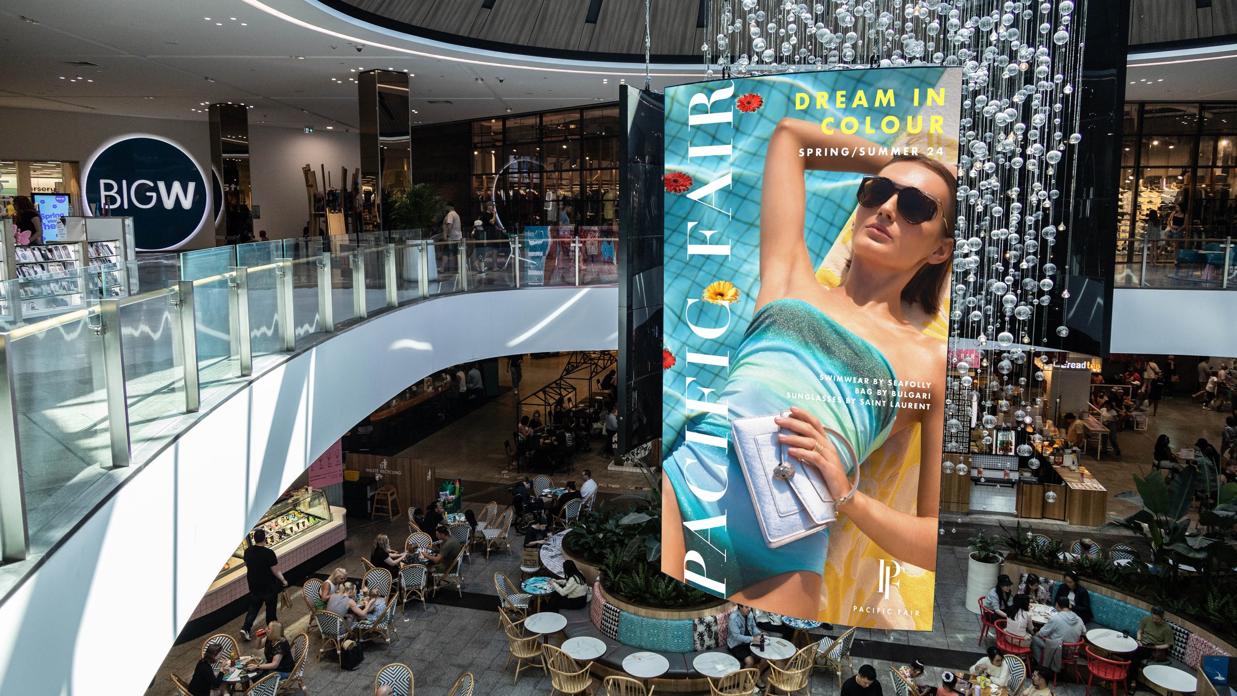
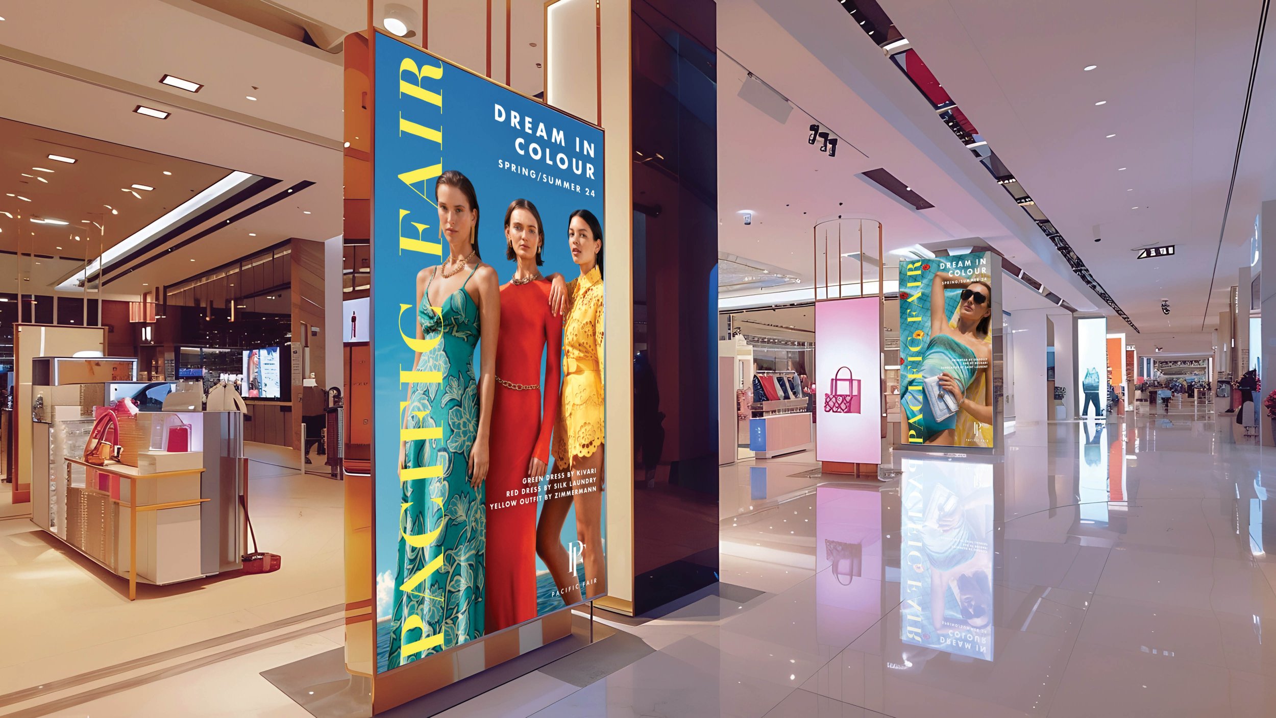
Dream in Colour Campaign
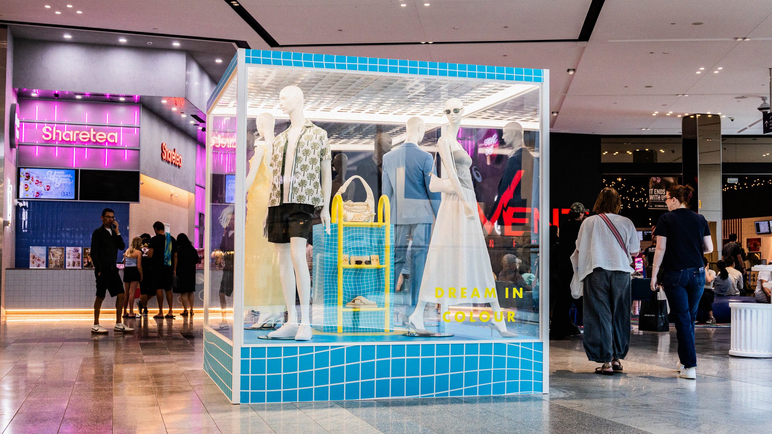
For Pacific Fair's 2024 campaign, I introduce a vibrant new hue of bright yellow to complement stunning high-fashion photography. The chosen theme, “Dream in Colour”, (meaning to have bold ambitions) creates an otherworldly atmosphere that perfectly aligns with the visuals. By leveraging striking imagery alongside engaging in-centre activations, Pacific Fair is reinstated as a premium destination for high-quality fashion shopping.
Art Direction / Client: Pacific Fair Shopping Centre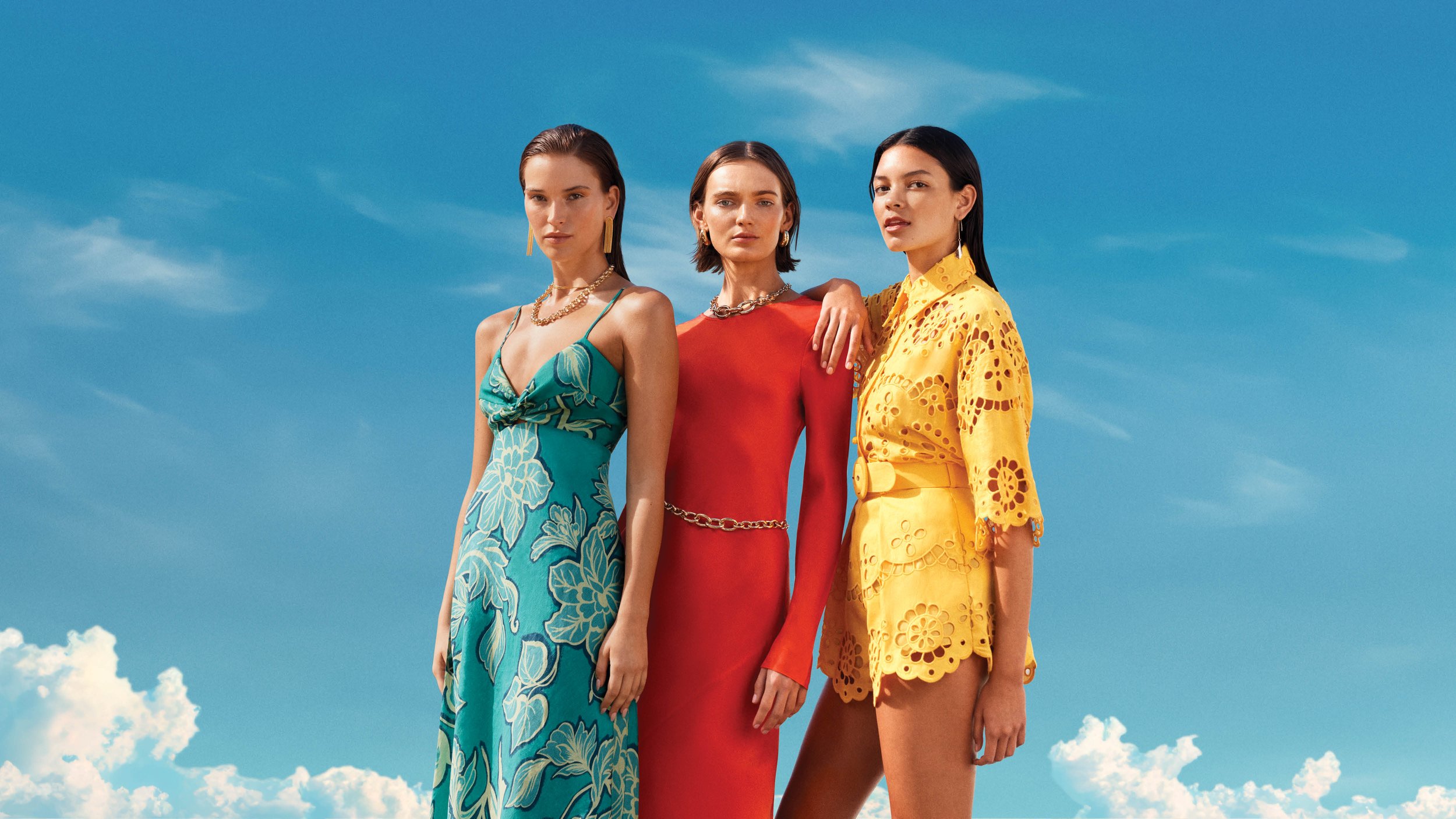

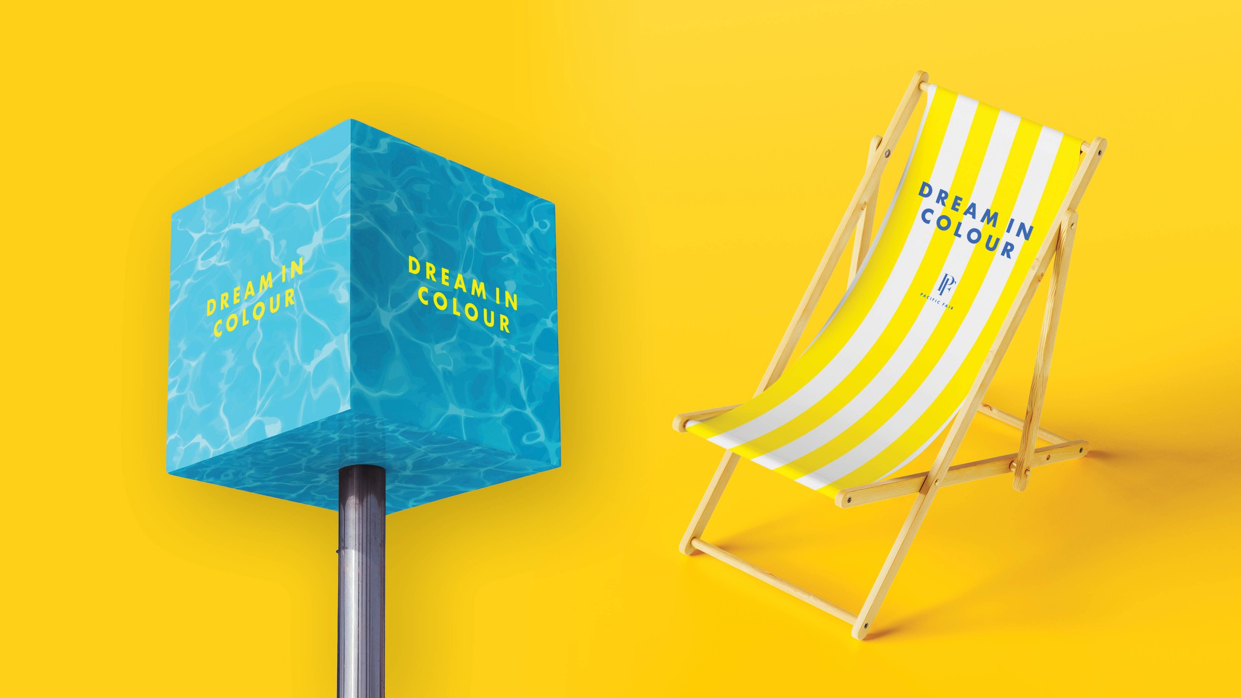
Art Directon Inspired by Bees and Flowers
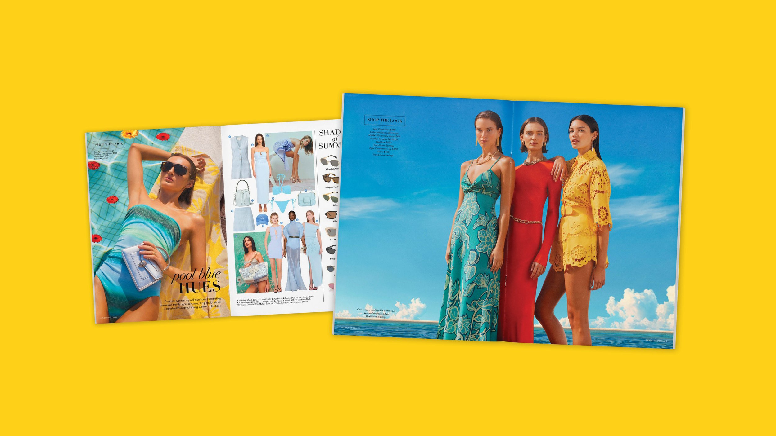
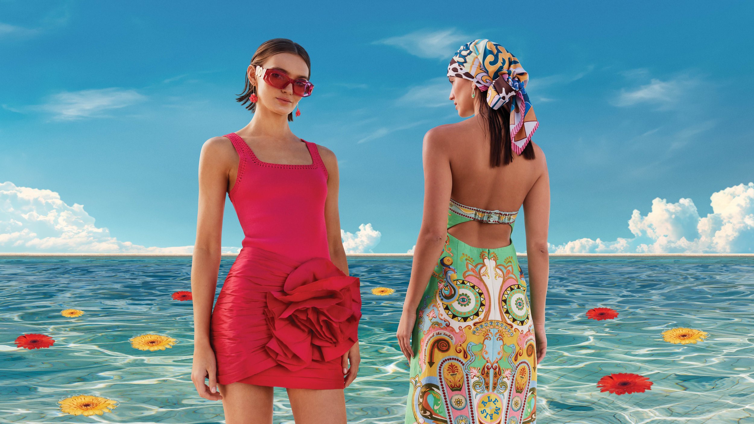
The shoot direction was rooted in nature, specifically the way flowers use vibrant colour to demand attention. For a spring campaign, it felt instinctive to dress the models accordingly. Bright yellow - the most visually dominant colour on the spectrum - was then pulled directly into the design layout, blurring the line between the imagery and the page.
This wasn't a subtle direction. It was a deliberate, full-commitment celebration of fashion as self-expression.
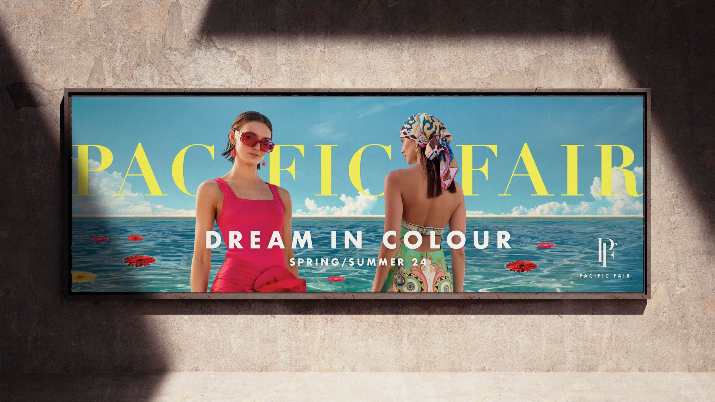

An Aspirational Headline
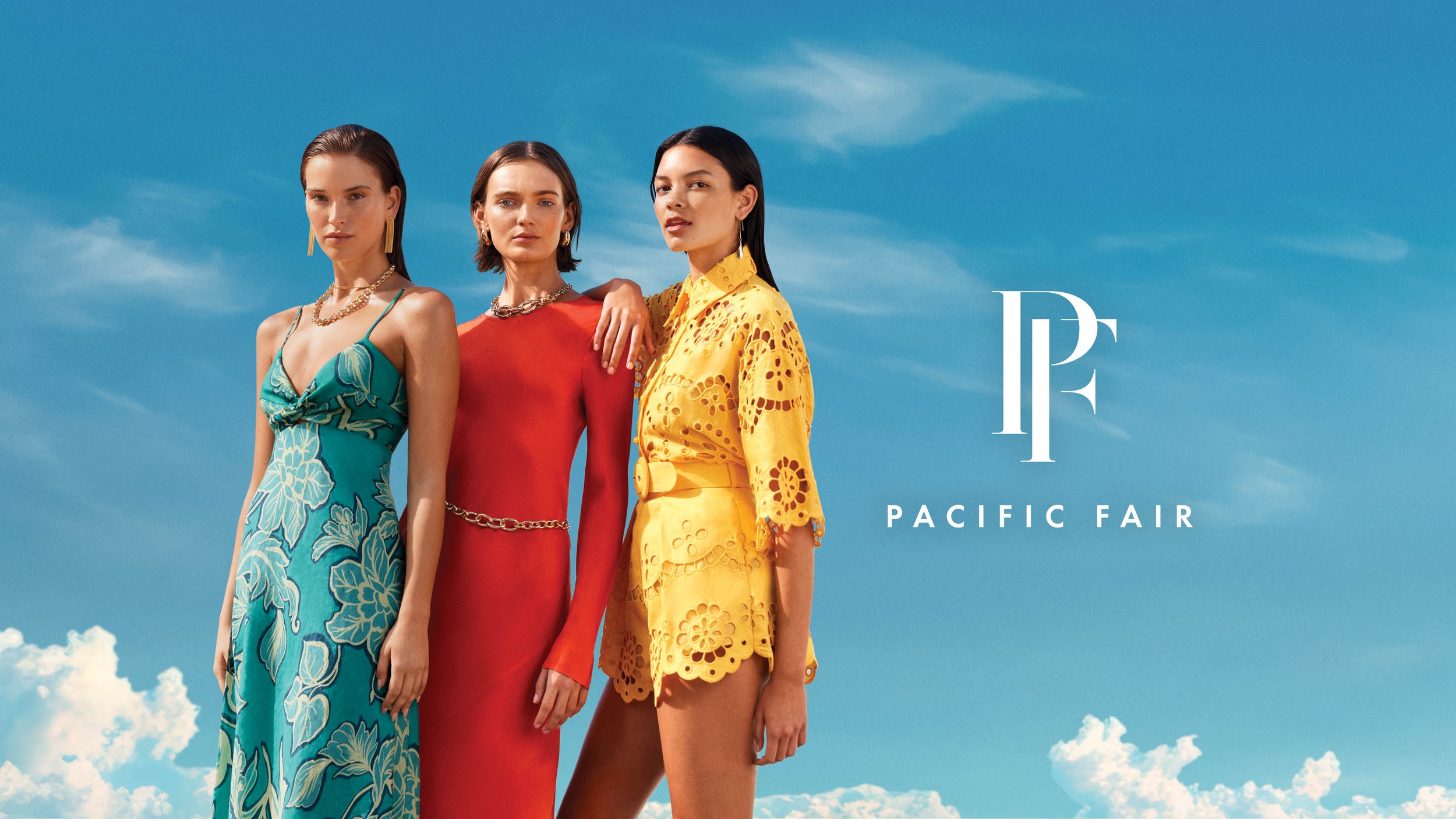
"Dream in Colour" positions fashion as emotional permission — not a purchase, but a feeling. The campaign leans into colour as identity, inviting the audience to project themselves into something bigger and brighter than the everyday.
The sky backdrop isn't decorative. Open sky signals freedom and possibility, grounding the aspiration in something universally felt rather than trend-driven.
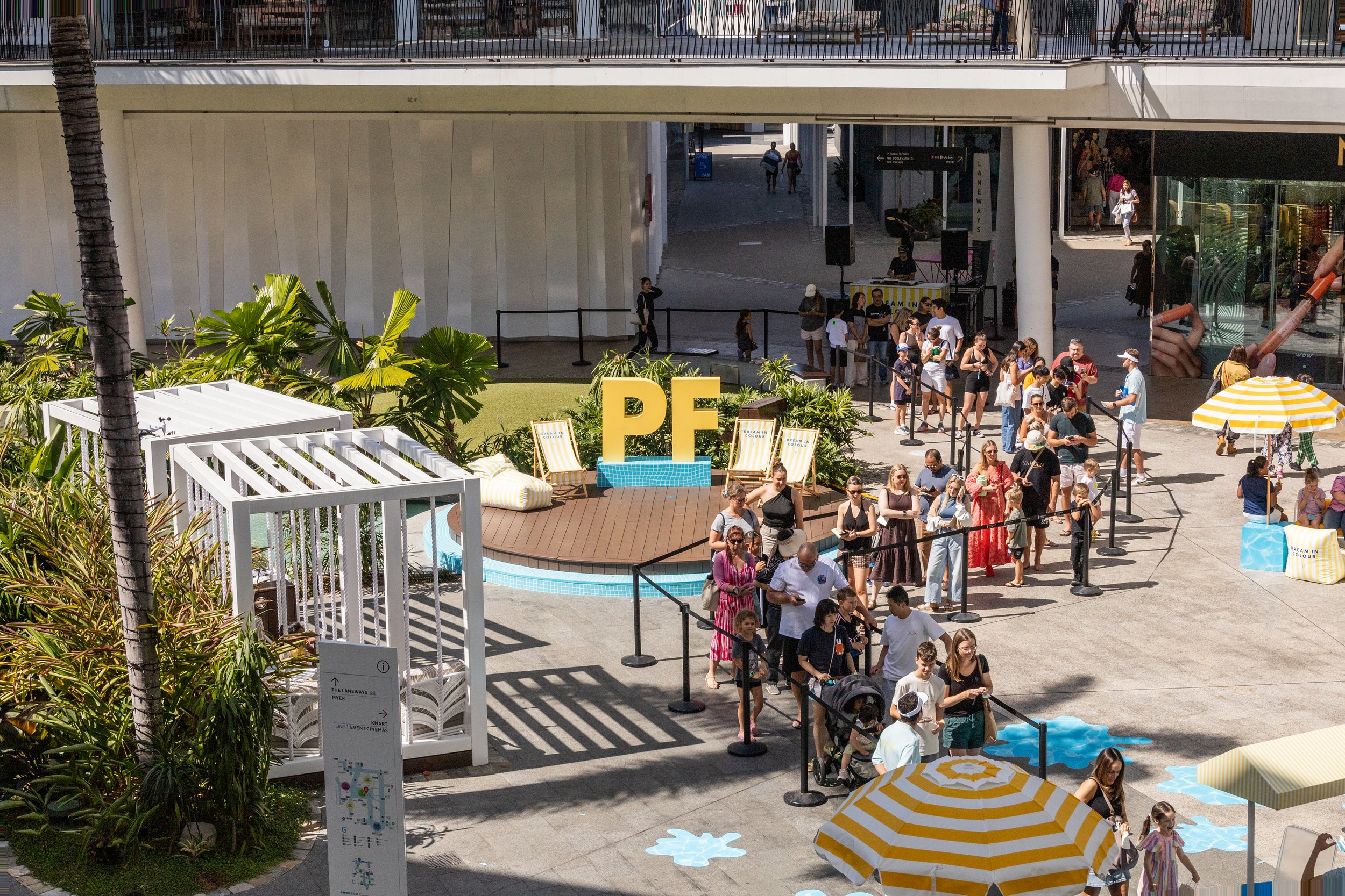
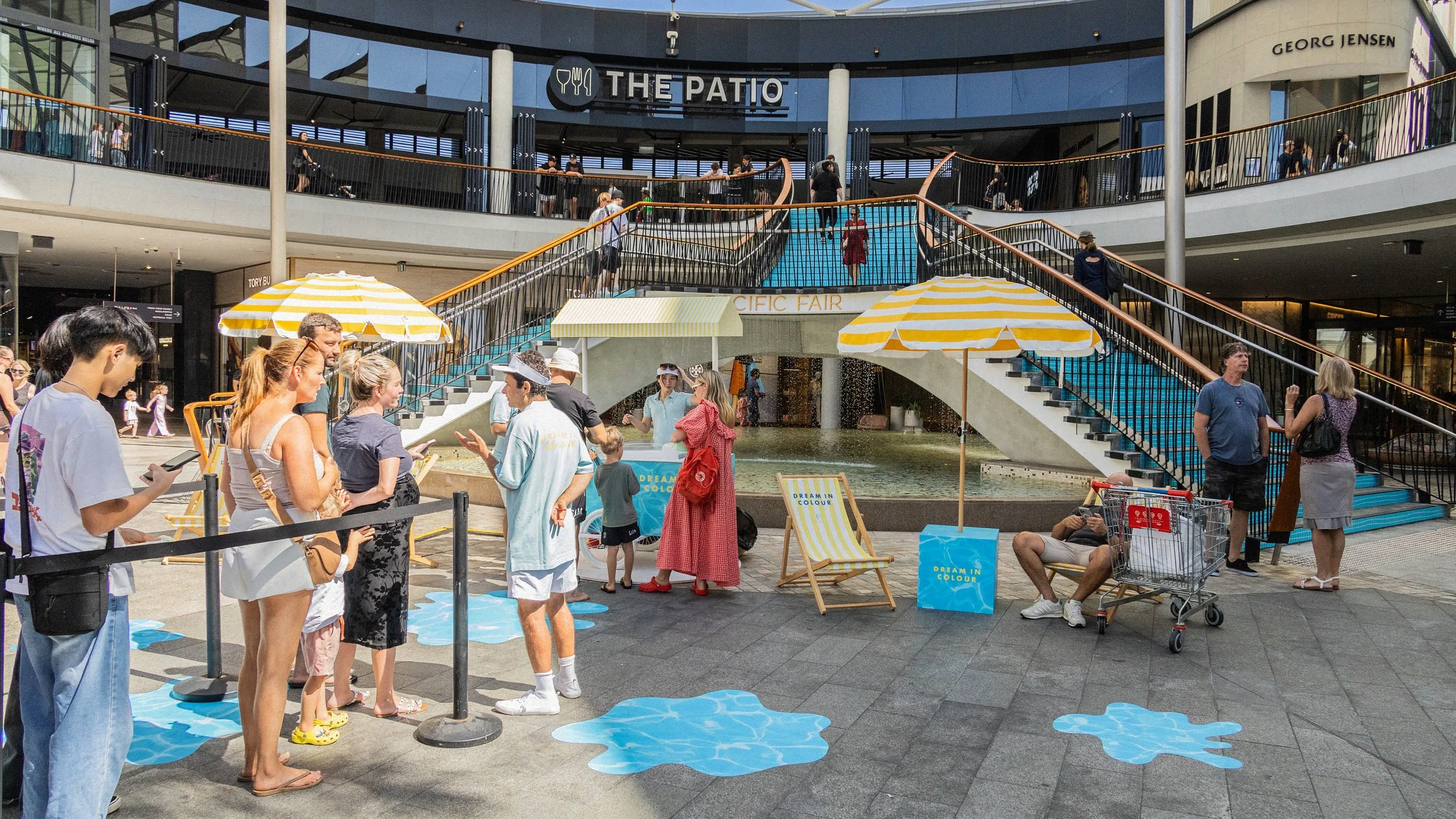
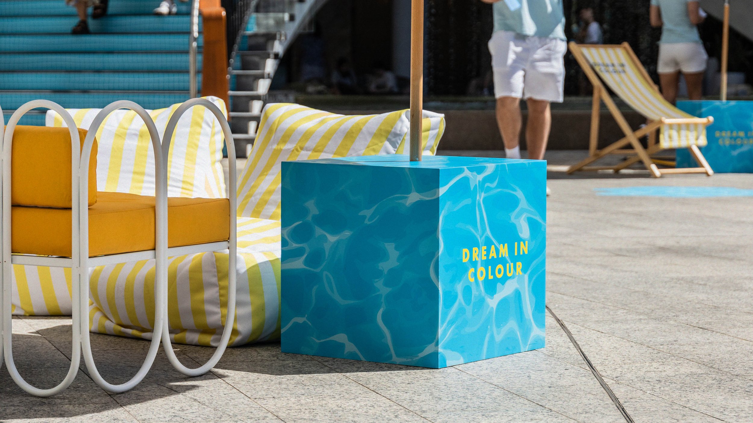
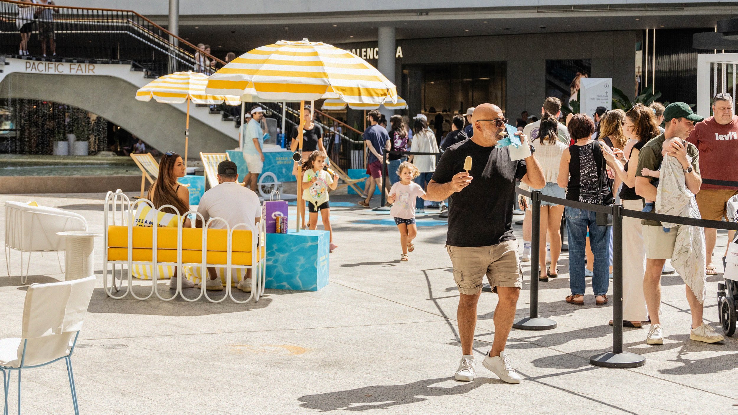
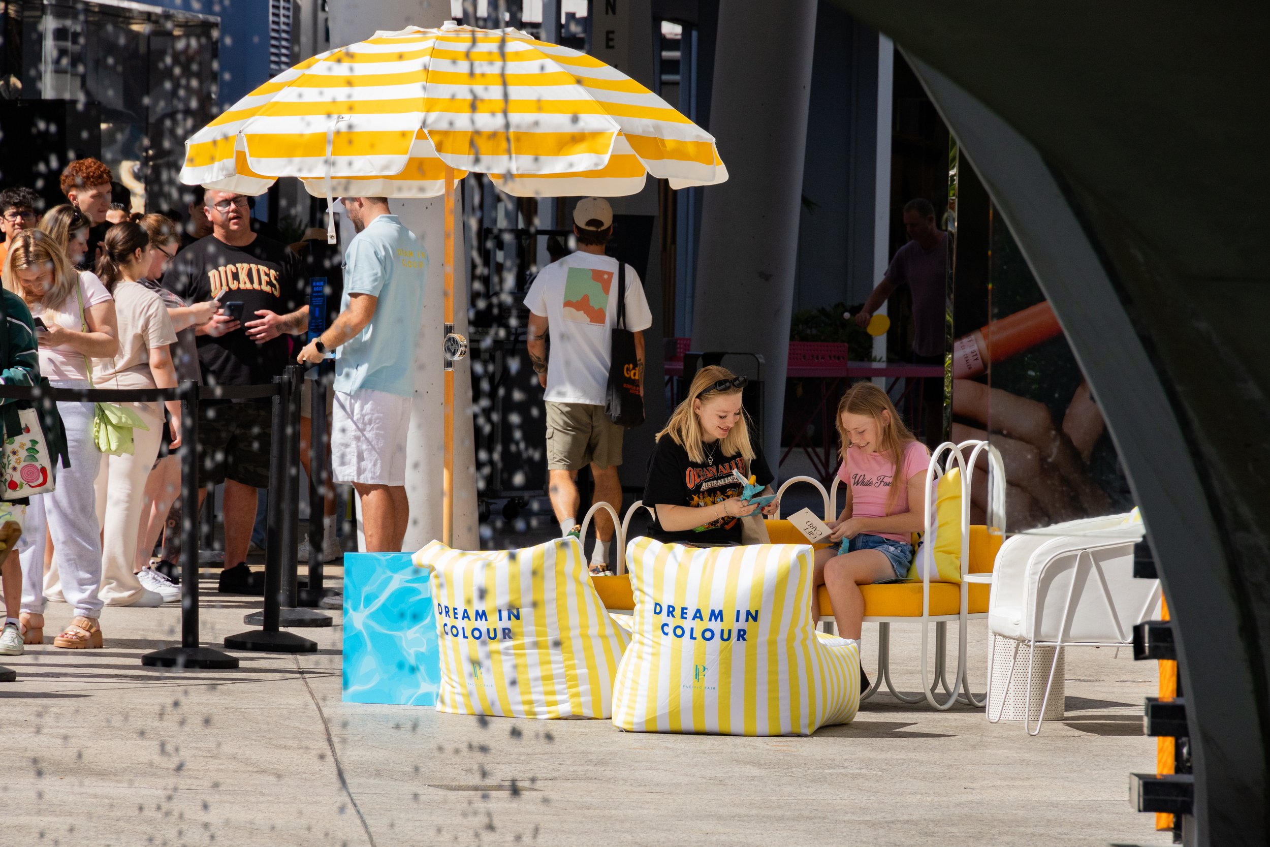
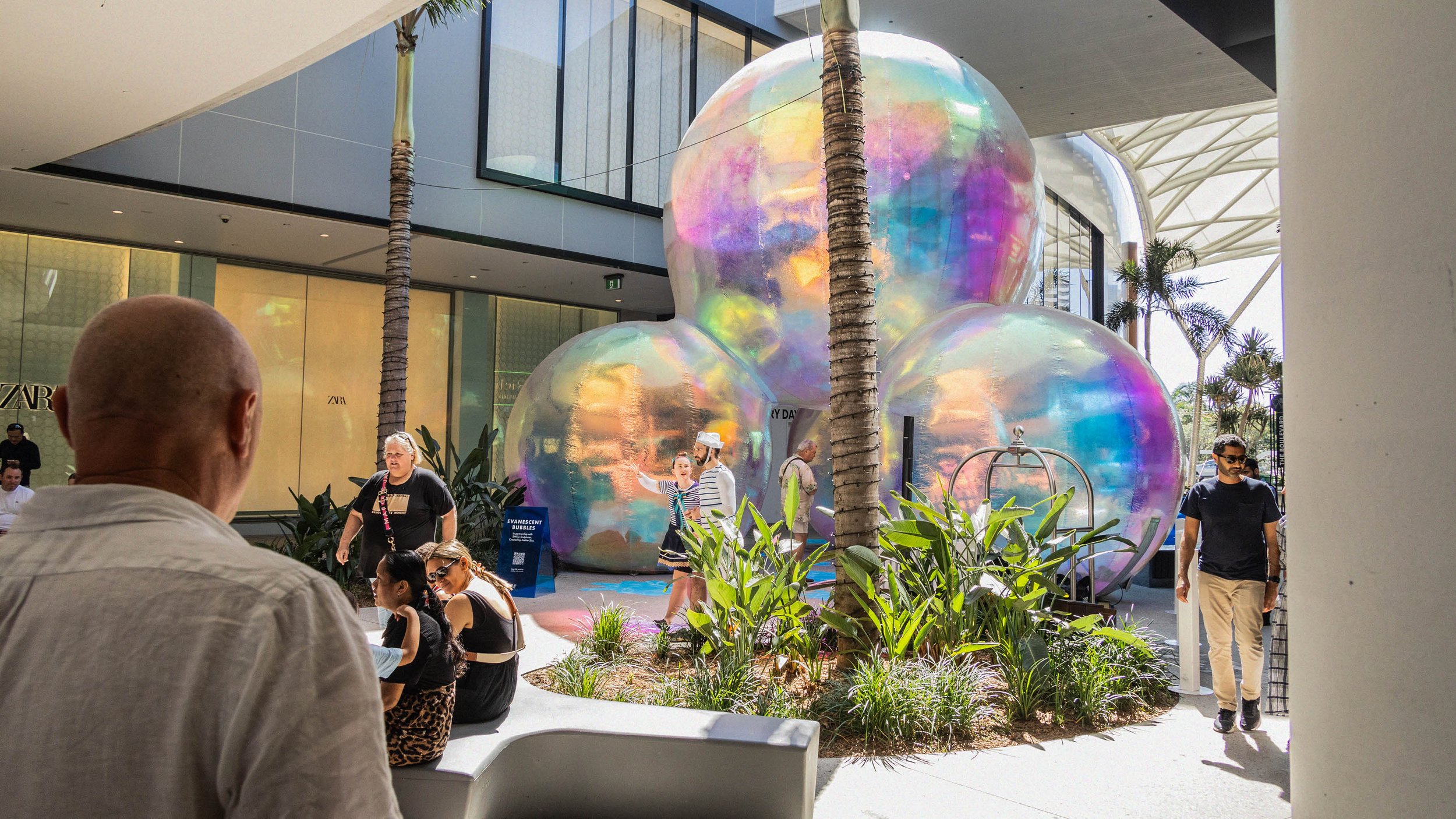
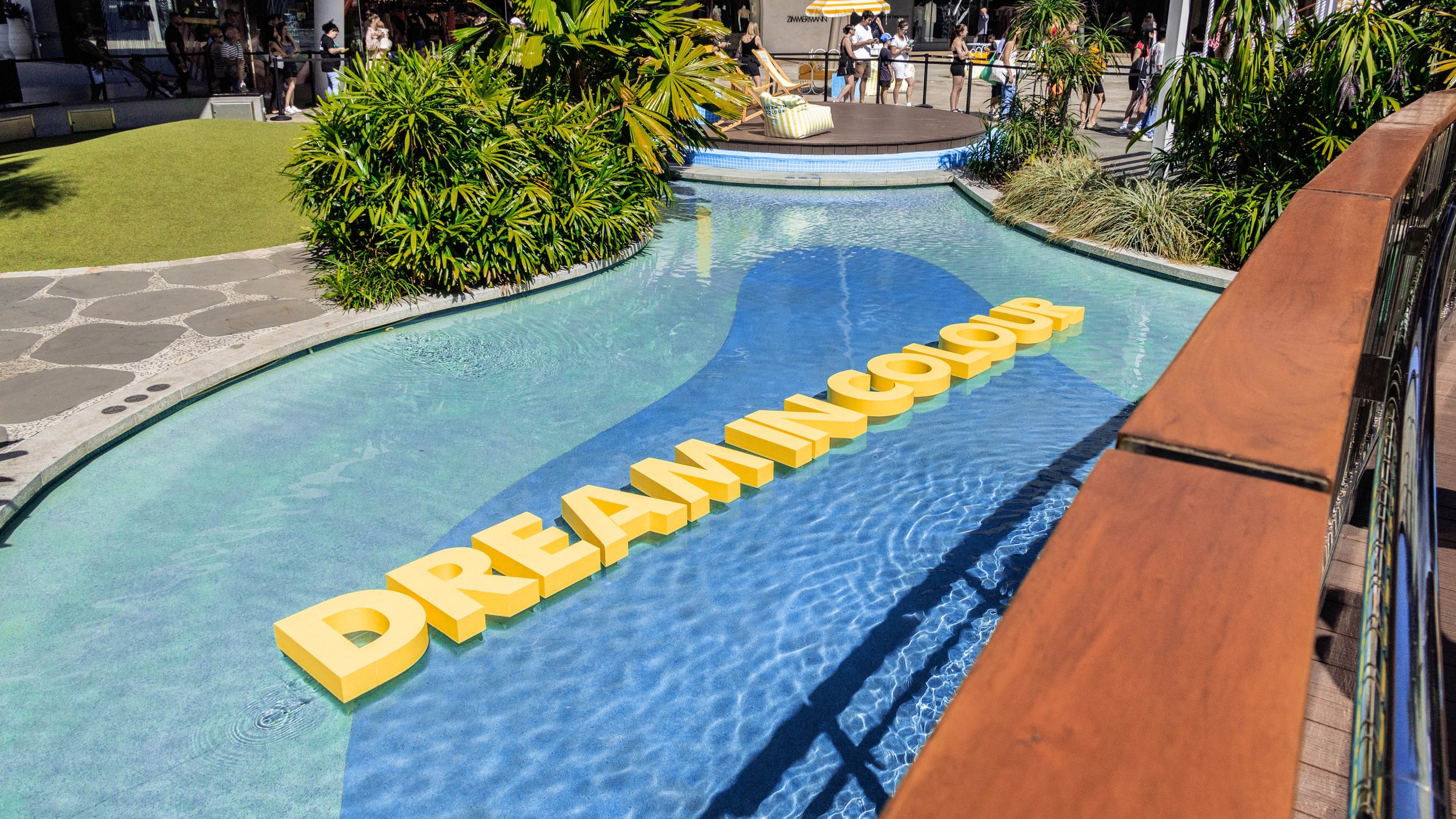
Activation Evolution
Pacific Fair took the campaign direction given to them and turned it into a bold and colourful activation. They held a lunch and invited influencers to dress in their brightest colours. They handed out “Dream in Colour” popsicles to Gold Coast residents. They also transformed their in-centre experience to be colourfully themed.