About
Client Work
Creative Agency Brand Refresh
I was asked to take the Brother brand mark and expand on their branded visuals in a dynamic and interesting way. Our end goal was to re-engage clients using creative graphics. This project resulted in a custom coded website designed in Adobe XD, fresh visuals for pitch decks and ultimately a cleaner, more modern look.

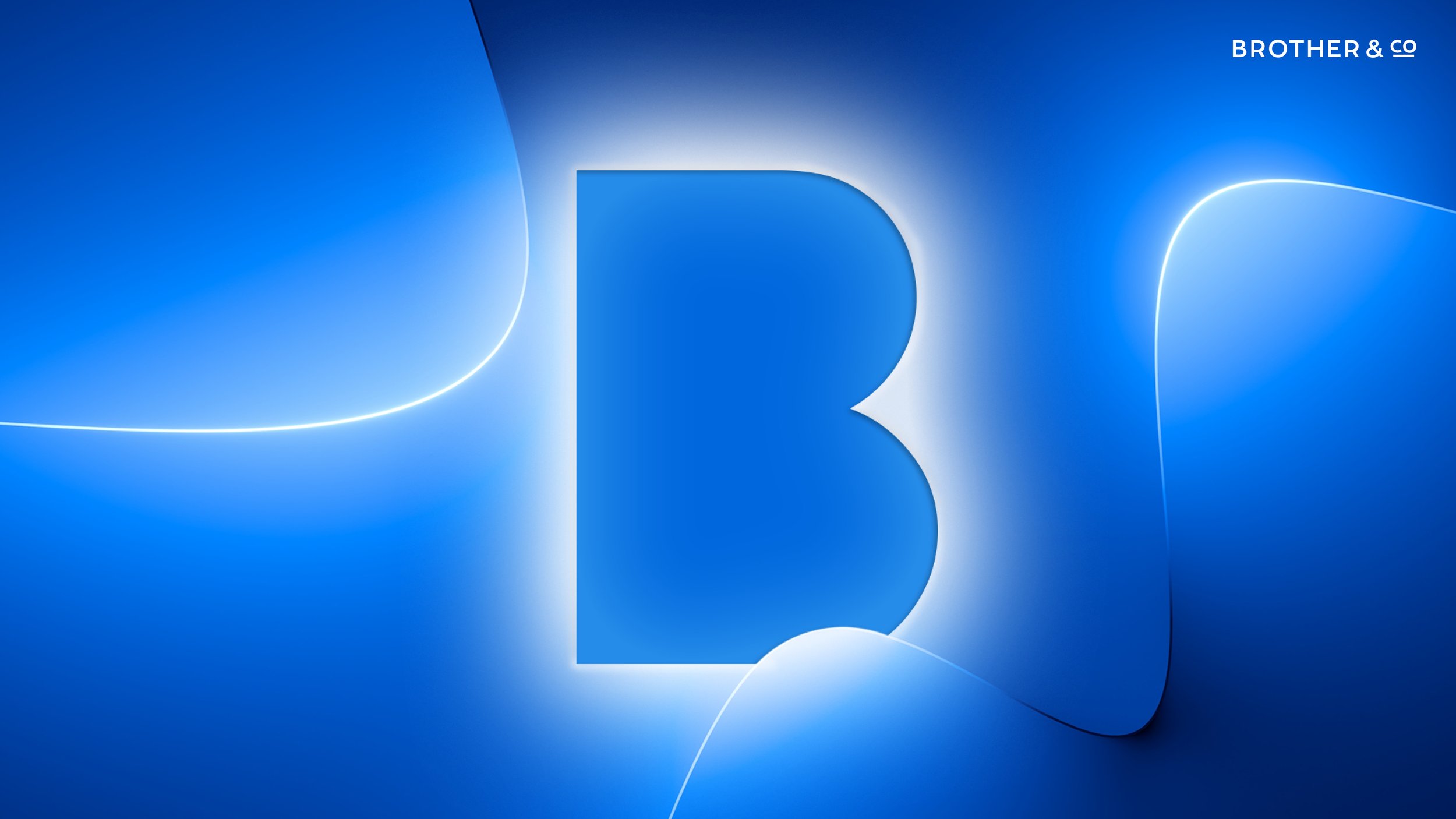
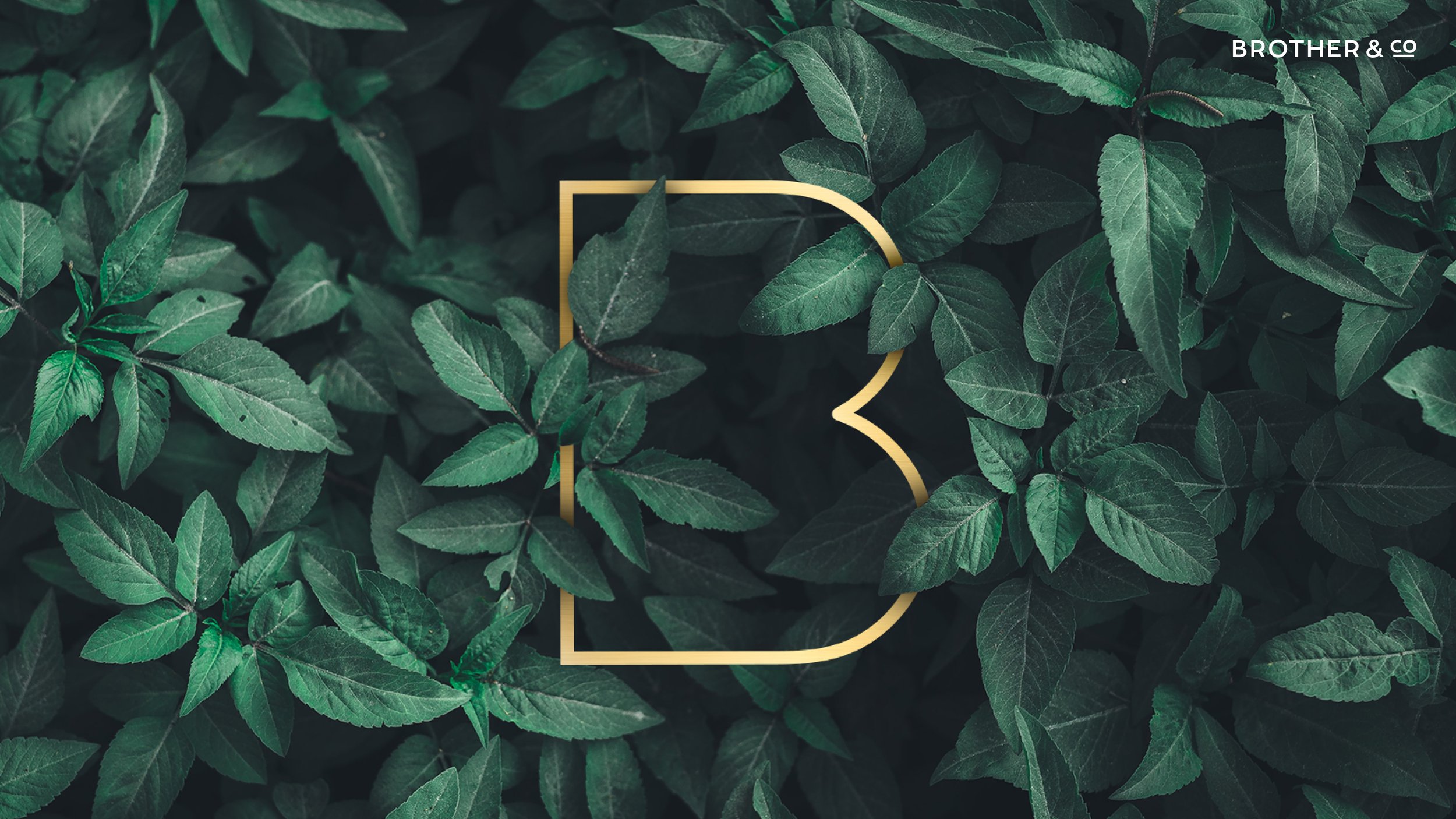
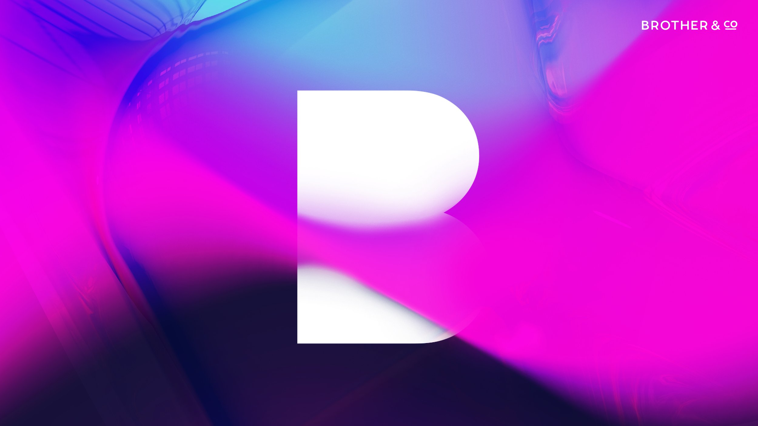
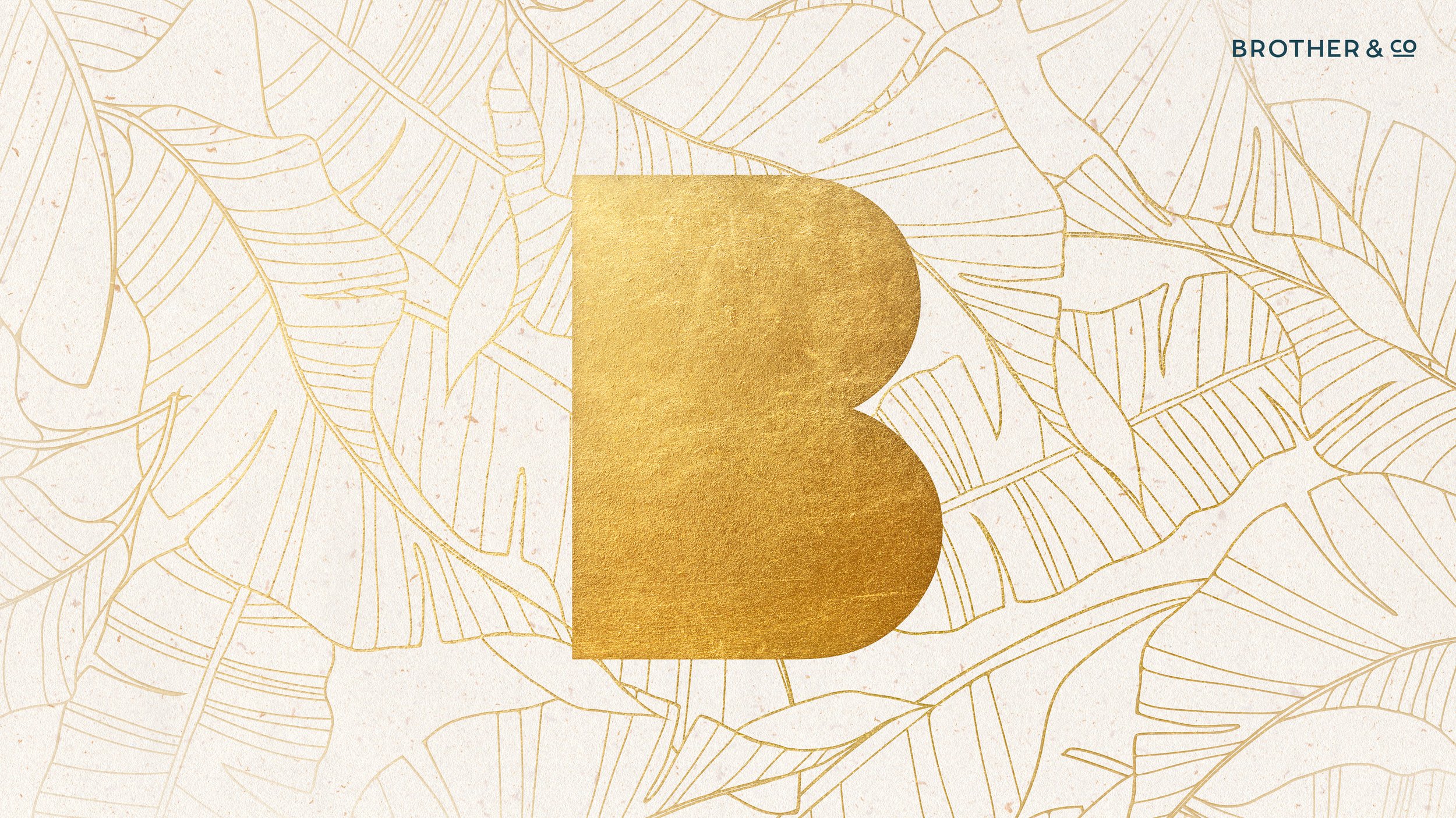
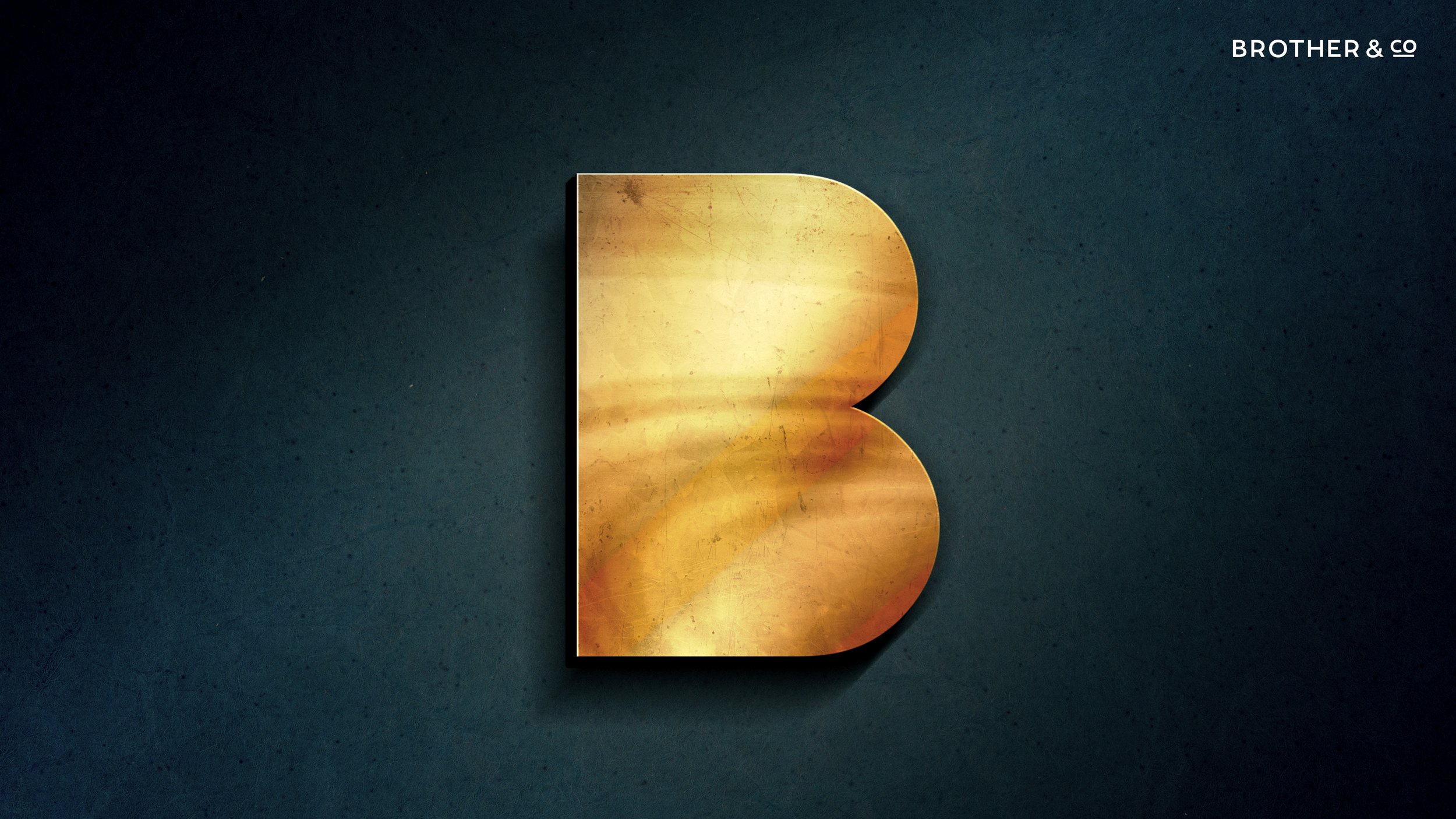
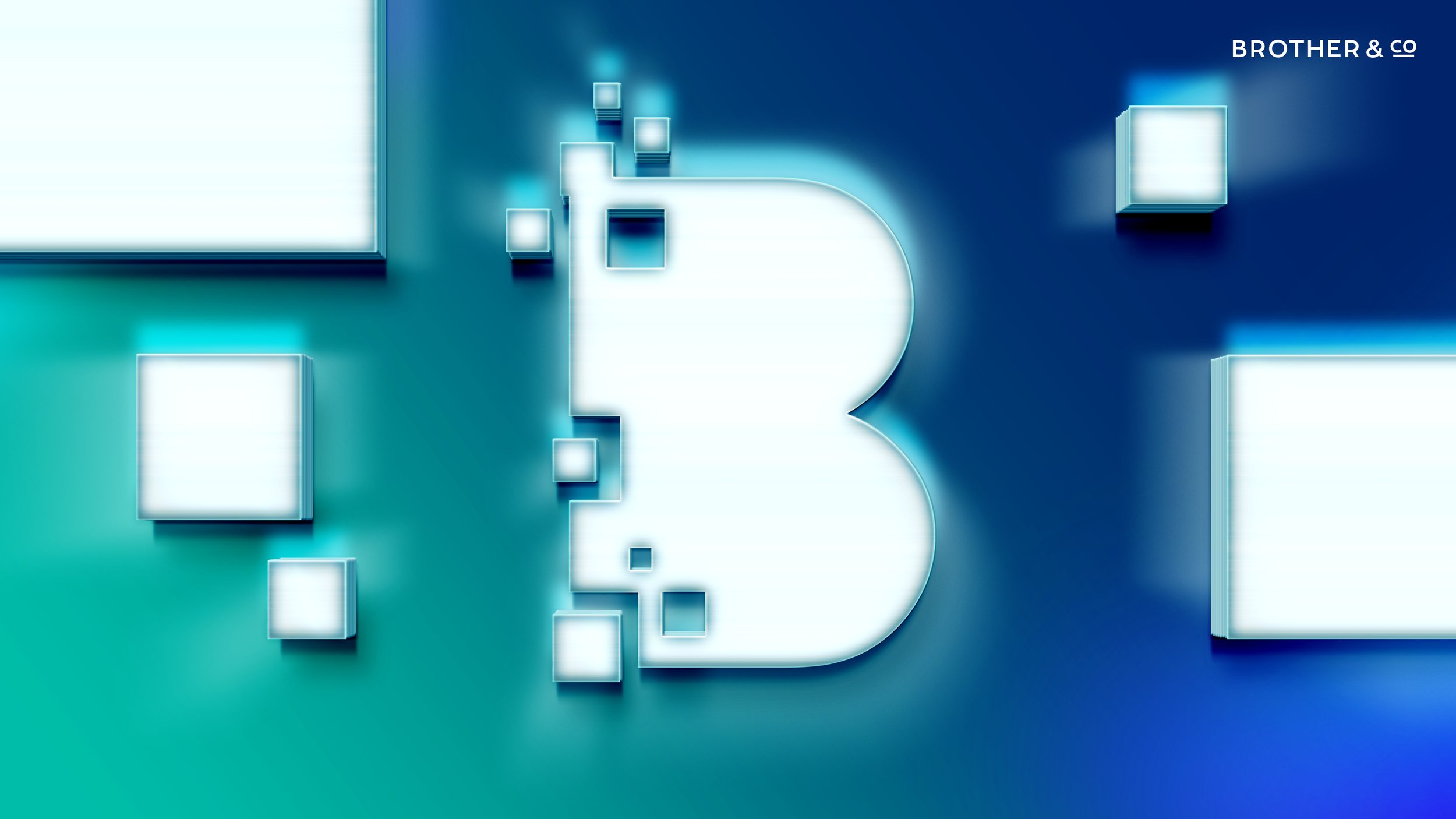
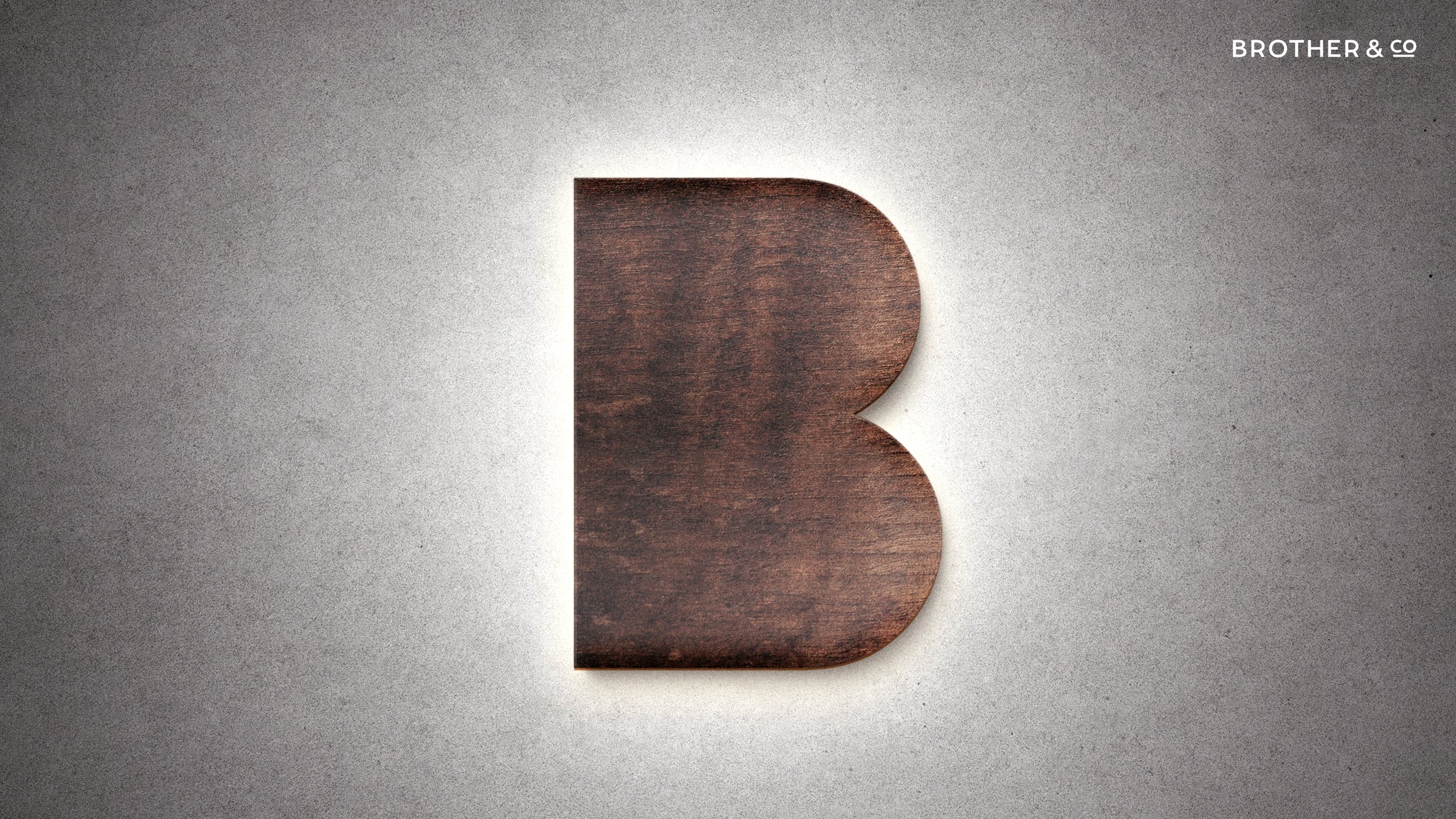
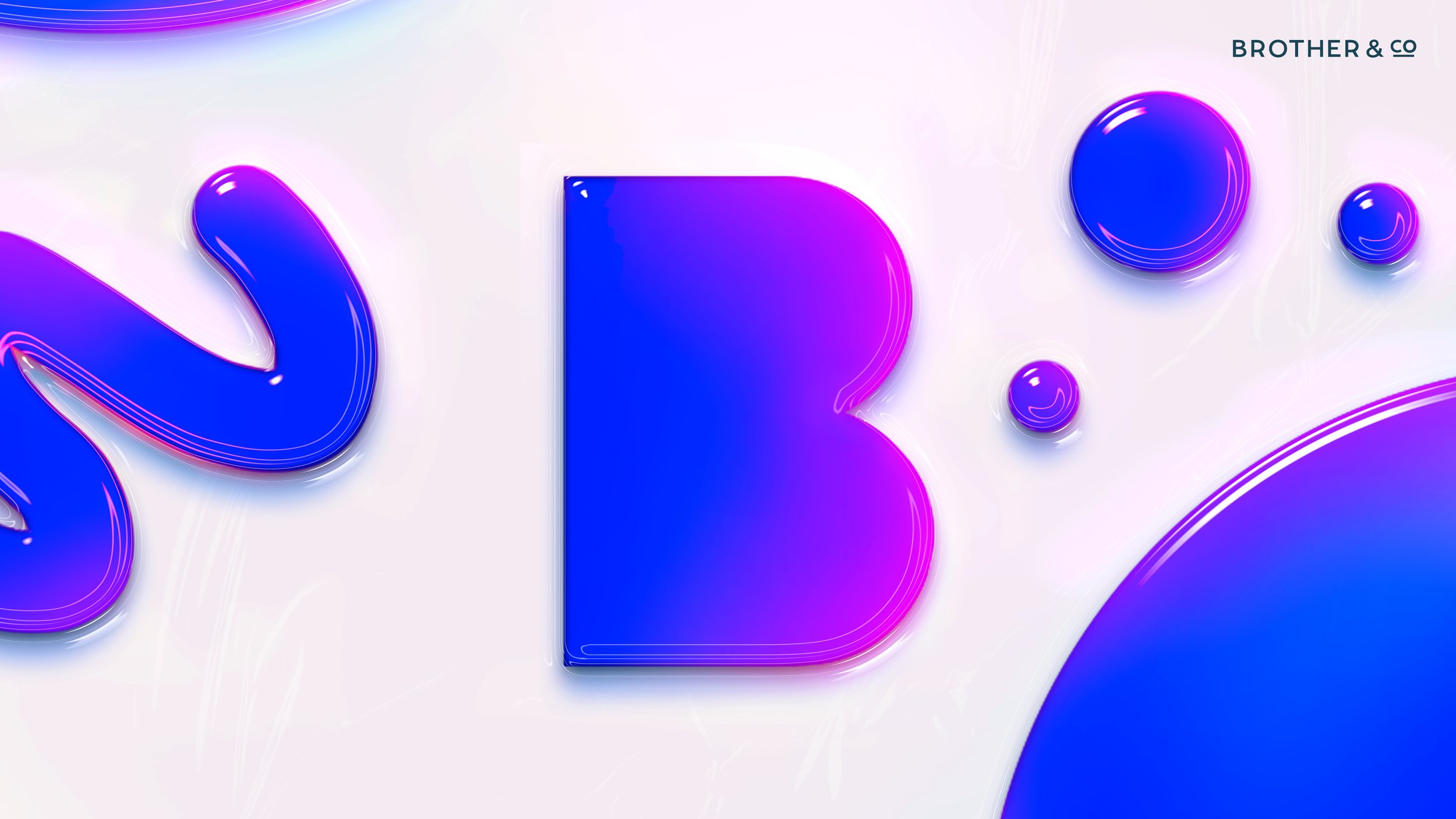
My strategy involved taking the B shape and turning it into a symbol that could be reinterpreted many different ways. These B graphics became hero images that would populate their new website and pitch decks.

“This dynamic visual system of transforming B’s perfectly embodies the creative agencies motto: Transformational Creativity”
This website redesign is clean and minimal, allowing the agencies work to take the spotlight. The line device (inspired by the logo) has been incorporated in a way that connects all the work back to the Brother&Co mark in the top left corner of the screen.

